I'd like to thank everyone who shared their RPG characters with us in the last Character Contest. All of the entries were fun and interesting, so if you get the chance it's definitely worth the time to click through to the actual images.
As usual, after the jump I'd like to present some of the entries I thought were particularly worthy of an Honorable Mention for one reason or another, and then the overall winner.
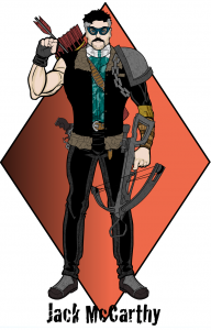
First up are a few example of creative posing used to make the character in question look very unique and dynamic, starting with Imp's "Jack McCarthy":
I really like the simple but very effective way the arrow looks like it's being drawn for use. It's not complicated, but it delivers a very strong effect. Plus the character looks bad-ass.
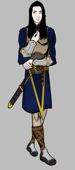
Iago Valentine's "Antares" image conveys a real sense of shyness and character that I wasn't sure the program was capable of. You definitely get a feel for who this character is as a person, which is the whole point of all the fancy maneuvering it took to get here:
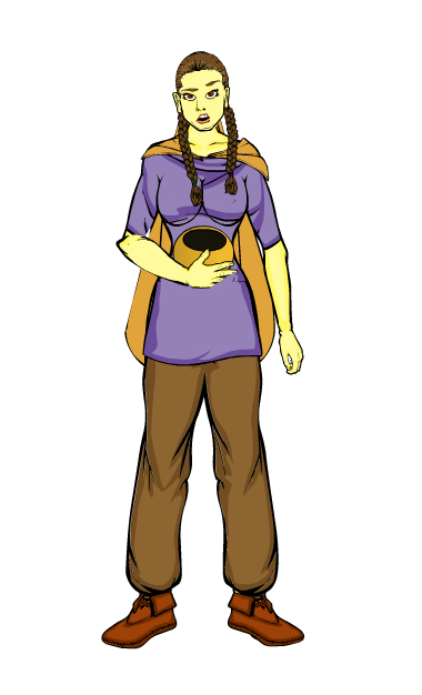
On a slightly lighter note, Melis used subtle turning of the head and facial features to give us another character rich with ... well, I was going to say "emotion" but maybe "lunch" would be more appropriate:
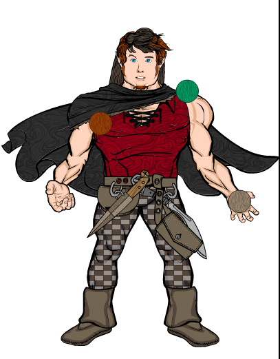
Finally, PyrateHyena turned in what I think is one of the nicest halfling types of character images I've seen yet, combined with creative use of several round items to let his little guy juggle:
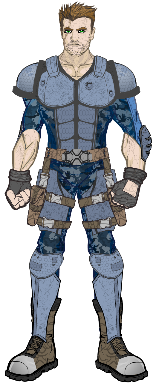
And now I wanted to give you the three characters that I thought made for the best overall images, culminating in the actual winner of this week's contest. We'll start with Damien's "Mikal Scott", which uses a lot of the techniques he gave us in one of his recent postings about making the character appear to be at a three quarter view angle. But putting all the trickery and behind-the-scenes stuff behind, this guy just looks really cool. The color scheme is tight and well suited to the overall mood, the patterning is subtle, and the overall design hits exactly the right note.
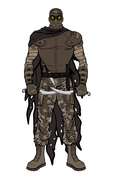
Paul's post-Apocalyptic wastelander also nails his genre, with a lot of the same attributes as Damien's. In some ways this is a very basic design, but it all works really well together, and the overall impact is very strong. Nice job Paul!
And now, your winner, Darkvatican's "Bren Stoneanvil"!
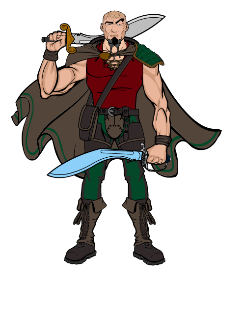
The combination of the cape, the cocked eyebrow, the weapon on the shoulder, and the blue blade of the foreground knife-sword all combine to give this composition a dynamic, living feel. I like the color selection, and all of the items "fit" him really well. The custom knife-swords are also cool, and add to his sense of menace. Overall a very pleasing design, and a deserving winner in a very tough week.
Thanks again to everyone who entered, and especially to Darkvatican for coming up with the winner. He gets to choose either any one item or a caricature of his head to appear in the final HeroMachine 3 product, there to live in immortal infamy! Or famy! Why is that not a word?
Now get back out there and keep gaming!

