Jeff said I could start ANOTHER weekly column if I wanted, and I think this one is closer to the idea of what he wanted me to do in the first place anyway. So I give you Mechanics of Creation, an in-depth look with pretty pictures of how to do some really amazing things with HM3. I'll start off again with my recent winning entry, Fierra the Feyrune, since she took so dadgum much of my time to make look that good.
More after the jump.
I'm also going to take this opportunity to plug the program Paint.Net for those up-and-comers who continually ask about saving options and fixes. All my work is done with the PrintScreen button on my keyboard and Paint.Net. You can find it for free at www.Download.com and it works like the poor man's Photoshop it was meant to be. My greatest complaint, though, is the loss of an airbrush tool. The other is its default to paste directly into the current layer (my Photoshop always pasted into a new higher layer) but it does offer a "Paste into new layer" option with keyboard shortcut (Ctrl-Shift-V.) So it's all good for most things.
Anyway, the apparent highlight for some were the "beast legs," a trick that I've been working through almost since the beginning of the HM3 alpha. The trick is using the "jodhpurs" from LegwearStandard:
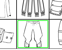
The jodhpurs are great replacement animal legs because of the sudden narrowing at the ends of the legs; with the right shadowing effect, it can make them look like they actually go behind the wider legs at the top.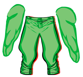
Now, for my demontration here, I've copied 2 pairs of jodhpurs from LegwearStandard (note the red border behind) and a pair of upper legs from BodyStandard. Please note that for the right anatomical look, I've rotated the legs opposite their usual position, so the knee is on the outside. (This way the legs don't switch position every time you try to transform them.) They're on a 23-degree angle now, and twentyish seems about standard for this trick, assuming no other major changes to the parts.
Now, I'm going to assume that you don't know about masking, just in case. Masking is placing one item inside another item's boundaries. By lining up the leg part correctly, I can give these pants the impression of having large muscles underneath. The only iffy part is the black lines (or whatever color you've chosen) poking through, but you can solve that with clothing, fur or the odd item cleverly obscuring the lines like Rob Liefeld hiding feet.
First, you move the leg on your left over the pants. When the leg goes transparent, it will help you to line the leg up the way you want it. MAKE SURE THE LAST THING YOU CLICK IS THE LEG OR IT WILL SCREW UP AND CAUSE YOU UNENDING TORMENT TO FIX. Not that, you know, I've had any issues with that or...Um, second, move the mouse over and click the "Mask" button near the top of the window. Then click the black-lined pants and--presto! you have one buff leg.
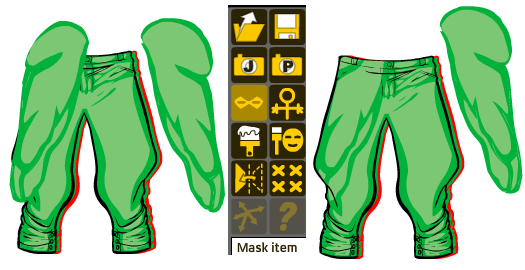
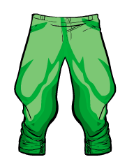 Repeat the process with the rightmost leg and the red-lined pants, move the red pants back under the black and all that's left is to resize the legs to however you want them. Also, don't forget the color differences you could add; like the example at right, where I changed the color of the jodhpurs underneath to give a shadowed effect, it can make a world of difference on the illusion of depth in your artwork.
Just remember, though--the one weakness of masking is category. If you were to mask these two legs like so and then choose, say, an arm or torso, the masking would click off, leaving your once-masked legs obscuring parts of your design until you remask them. One fix for this is to leave the items to be masked in the far back, lined up correctly and just waiting until you finish the basics of your project. Then you can bring them forward and put them back where they belong.
Another cool addition to your arsenal in HM3 is the new Shields category in the ItemRight section. Many of the shield selections were chosen to give you ready-made heraldry (which, to the less Ren-Faire familiar, is the shapes and positions of colors to go with a royal emblem. And no, I'm not terribly familiar with the exact science of designing 18th century heraldry, so if you think mine looks like crap, that's why.) For examples, look left:
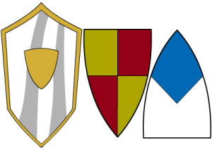
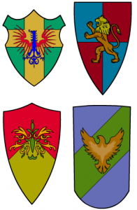
But why stop there? The possibilities are endless with masking! You can create a huge variety of personalized heraldic schemes with just a little color-tweaking and some creative masking.
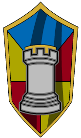 For instance, I used two of the shields with the reflective shine (look above and right) and made the central section transparent. I masked the middle shield you see there to the first reflective shield, and the right-hand shield to the second.
By placing both masked items below the first reflective shield (with some creative resizing) I was able to come up with a unique heraldic shield item. Add an insignia of choice and you're ready to rumble in the jun--I mean 18th century England. Or France, or wherever.
And that is the power of masking, my friends. Experiment to your heart's content, and post that content in the next contest!
(If anyone has questions about Paint.Net, please leave a message here and I will try to answer it. Please remember, however, that I'm just an enthusiastic user, and might not know the answers you seek.)

