First, I'm sorry to be so late posting this. It's been such a long day that it's actually tomorrow already. Or something. I hate time travel.
Second, THANK YOU for all the great entries! With almost 100 comments, that was one of the best responses ever, and the quality of the entries was very, very high. If you don't see yours listed as a finalist, that's probably just because I ran out of space, because I could easily have included a dozen more really stellar examples.
Anyway, on with your finalists!
First up is Whit's simple little guy:
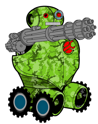
I ultimately decided not to make this the winner because so much of it was the pre-drawn Companion, but the little additions really make a huge difference. I love the way the mini-gun happens to be pointing the right way, and how it nestles into that arm portal. The patterning is perfect. I love the off-matching eyes, and the wrench logo, and the insignia used as wheels. It's a simple, but very effective design, the little guy just oozes personality.
Speaking of the creative use of items, DJ had a whole series of characters built entirely from one Slot's worth of items, which I never would have thought possible at all, much less in a way that resulted in a nice looking image. But he pulled it off. My favorite of them was the one based on Shoulders:
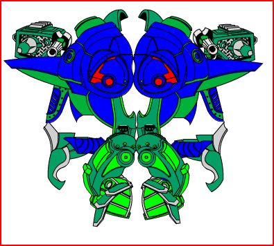
It's really kind of menacing, isn't it?
Hammerknight also blows the lid off this application, constantly showing me things that amaze me. My favorite of his several entries was probably "Boarbot":
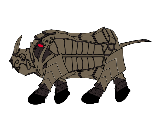
I love how he looks like he's walking, the rhino-horn, the left profile, the little robot tail, the segmented side armor, the patterning on the nose, the glowing eye, all of it. A really nice, and creative, image.
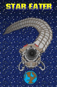
I was also blown away with a couple of the entries in terms of the illustrator's ability to assemble an entire scene, despite the complete lack of actual scenery in the application. First up was Neon64's shoutout to one of my favorite Star Trek episodes, fresh on my mind since I went to see the new movie yesterday:
I really like the curved tunneling effect of the mouth and the body, along with the little mouth pincers ready to gobble up our little blue planet. I'm always a sucker for a planet-eater.
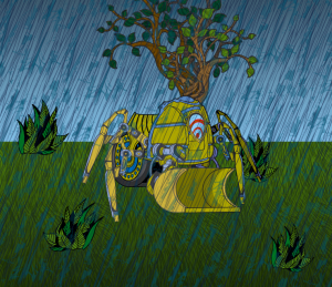
The king of the Setting, though, has to be Damien. I admit, I sat there for a good five minutes trying to figure out how in the hell he pulled this off:
It was the diagonal bandages-as-rain that really threw me. I mean, who thinks like that?! In terms of sheer creative use of the tools to make something unique that I had never even imagined, Damien and Dig-Bot definitely take the cake. Hats off to you, sir.
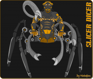
Another guy who pushes the envelope of what you can do with the HM3Alpha is Violodion, although he accomplishes it through painstaking and exacting detail more than the almost-maniacal freewheeling of Damien. I think "Slicer Dicer" is a great example of what I mean:
Look at all the patterning and the way each one complements whatever main item it's applied to, like the swirling in the hex nacelles in the spider body. Seemingly minor details like outlining the spider legs with gray to blend into the background instead of black just really put polish on the whole design. Really impressive work and dedication are shown in this one, well done Violodion!
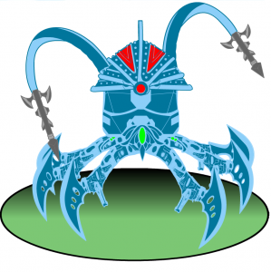
Taking a step to the lighter side, Worf also took a stab at an arachno-bot, and achieves a much lighter, more fun sort of character than Violodion's, although still very much in the form of an impressive and pleasing design:
The use of the plain circle gradient makes for a great, simple setting. I also liked the blue outlining of the legs, I think that's what really sells the whole thing.
ArtfulDodger pooh-poohed his own "ESPER13" for some reason, but I really liked it:
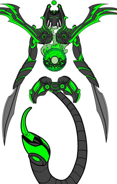
It's delightfully non-linear, with the separate pieces all hanging together via some sort of invisible bonds. It makes for a striking image. I also really liked the center chest design, with the funky logo in flames, that's just cool.
At the end of the day, though, there can be only one winner, and although it was an extremely difficult choice this week, I went with ... Brambles' "Cogsworth":
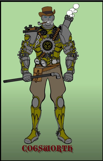
I'll grant you that some of the other finalists displayed more technical flair with their manipulation of the program, and I'll grant you that maybe some are, overall, "better" illustrations in a pure design sense. But Cogsworth is the one entry that really stood out for me in terms of the whole package of a character with personality, a solid satisfying image, attention to detail (love that "steam" coming out of the back tailpipe!), and strong design. I felt like this was an actual being in a story somewhere who I just hadn't met yet, which is a hard thing to pull off.
I could have -- and almost did -- go with another winner, and there certainly were some worthy ones as you've seen. But I just kept coming back to ol' Cogsworth, because sometimes, what you really want from a robot is not a face full of hot laser, but a warm toddy and a strong hug.
Thanks again to everyone who entered! It's so late here and I am so tired that I'll post the new contest tomorrow instead of today. Although as I said, it sort of already IS tomorrow. It'll go up later on Wednesday morning, if that helps!
If you have an idea for what the theme ought to be, by all means let me know in the comments or via email, I'm feeling decidedly uncreative at the moment.
Thanks again everyone, hope you enjoyed the contest as much as I did this week!

