By far, this week's contest proved the most difficult to judge. There were so many great entries, showing an amazing amount of creativity and versatility, I was honestly blown away. The images of the Finalists after the jump are fairly large, but I hope you'll review them all because they're really quite spectacular.
Many thanks to everyone's hard work who entered, I sincerely appreciate your taking the time not only to create your character, but to share it with the rest of us. Bravo, one and all!
And now, to your Finalists, with the winner to come at the end.
The first of the Finalists is Damien's "Mecha-Griffon":
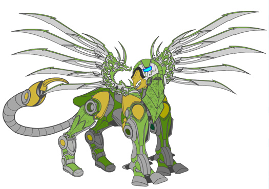
This was one of the earliest entries that made me sit back in amazement; I had never imagined this simple little program could be used to create something so cool. I love the thoughtful details like the different front and back legs, the way the head was constructed and given personality, and the overall color scheme. It's a really nice job of imagineering, and I take my hat off to Damien for not only this sample but for the many stellar illustrations he has in his online portfolio. Great job, sir!
Next is the guy who started it all, Hammerknight, with two Finalists, starting with "Mech-Golem 1":
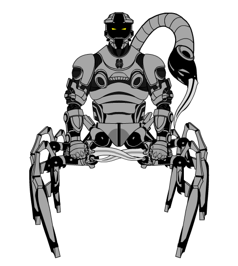
I love the arachnotaur concept, and when combined with a mech sensibility, the results are a lot of fun. This guy exudes a certain kind of menace, but I bet he'd take time to make fun of you before slicing and dicing you into tender little morsels. The swapout of the scorpion stinger with the same blade as his daggers is also a really nice touch.
The second of Hammerknight's creations I wanted to showcase is completely non-organic in a way I didn't think could be achieved with the application, and which frankly has opened my eyes to a whole lot of possibilities for this thing I'd never considered. I give you "The Skullbike":
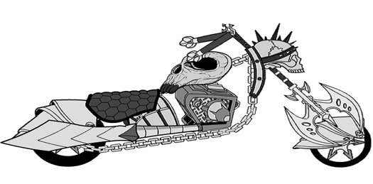
How do you even THINK of something like this? I just love it, from the battleaxe front wheel to the awesome side-facing skull headlight to the way he used curved chains for the chassis and all the way back to what I think is a glove used as a tailpipe. This thing looks totally cool, and I want one.
I've had to admit to Imp-love before, and the "Ashkarene Bishop" just cements that hopeless art-crush:
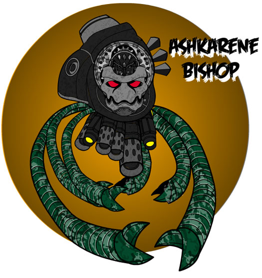
Again, you've got a non-humanoid but wonderfully scary creature that looks so, so wicked. I really like the asymmetrical construction, I think it makes the illusion of hovering more effective and convincing. Imp also has the "gradient circle as background element" nailed down, which gives his illustrations depth, cohesiveness, and a real sense of design. The chosen font is perfect as well. A thoroughly convincing and solid imagination of this creature, I really like it.
I kept coming back to Marx's "Quetzalcoatl", trying to figure out how he got multi-colored wings like this:
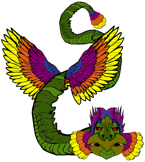
I think I finally decided that he used multiple copies of the same wing, scaled and positioned to nest inside each other, and colored in that very pleasing rainbow pattern. It's a very subtle use of the program's capabilities, and I wish I'd thought of it myself.
Worf's Draco, on the other hand, is anything but subtle:
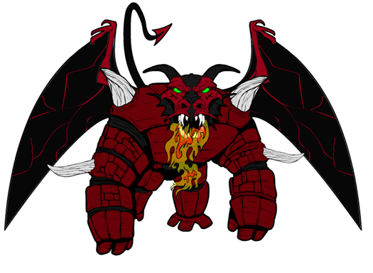
There aren't a lot of fancy tricks in his construction, but what's there absolutely fits perfectly. The unifying color scheme helps bring it all together, but it's the spikes that really make this illustration sing. I love the transparent flames and the dragon head, and overall this is a very convincing construct that I'd not be surprised to find in the next "Monster Manual".
And now, the First Runner Up. I had a really hard time deciding between this one and the eventual winner, and I think you'll see why:
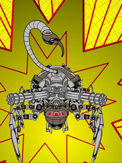
Neon64 entered at the last moment, and I am very grateful he did, because he's come up with a very strong composition for his creation. I love the big starburst with the smaller, web-filled pattern in the background, it just fits perfectly with the creature design. And what a design it is. The use of the darker color as a highlight to the gray metal gives it a depth and believability some of the other mech-creations lacked. The arachnotron looks menacing, deadly, and completely plausible; I'd not be surprised to see something like this in a major motion picture. An excellent, excellent design.
And now, your winner.
Clearly, given what you've already seen thus far, choosing just one design as the overall winner was exceptionally difficult. But I found myself coming back to this one again and again, and I think I've made a good choice in Artfuldodger's "Cerebra":
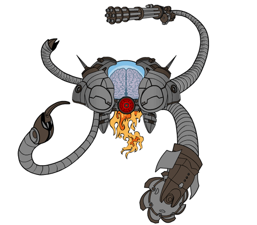
It has all the stuff I've already talked about in others -- excellent creature design, outstanding and subtle use of features, a solid and convincing color scheme (two main body colors serve to set off the central column of vivid colors brilliantly), a sense of menace, and believability. But it also screams "Super Hero Comic Book" in a way none of the others quite pulled off; I could totally see this thing making an appearance in "Invincible", for instance. I love the flames, and the open doors from whence they come. I love the combination of the scorpion tail with the mecha-arms. I love the sawblade glove fitted onto a tentacle. I love the way the shoulder pads make a vehicle, with the glowing brain-under-glass sheltered between them. And I love love love the red glowing Insignia with its promise of a hot, laser-y death.
So congratulations to Artfuldodger, who wins either any one item of his (or her) choosing to be included in HeroMachine 3 OR a caricature drawing of his or her face to be so included, to serve as the basis of a legion of global super-warriors!
And again, thanks not only to the exceptional Finalists above, but to everyone who entered. You all did an amazing job, and I am humbled by your creativity. Keep up the good work, and don't let those worlds of your imagining falter!

