In 1993, Topps Comics published "Ray Bradbury Comics No. 1", featuring two different versions of the classic Ray Bradbury short story "A Sound of Thunder". One dates from 1952 by Al Williamson and the other from 1993 by Richard Corben (produced specifically for this comic). After the jump I'll reproduce a page from each version at roughly the same point in the story; it's a fascinating look into how different the same script can turn out in the hands of various artists. You can read the original story in its entirety here if you like, it's excellent.
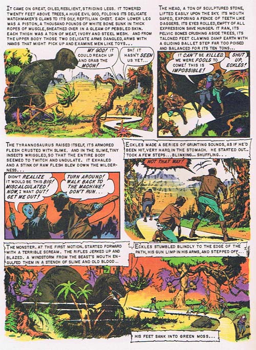
Al Williamson worked with the likes of Burne Hogarth and Frank Frazetta, having been the artistic talent behind the newspaper serial "Flash Gordon". Here's his version of the scene where the hunting party sees their prey -- the mighty Tyrannosaurus Rex -- for the first time.

What jumps out at me immediately is the amount of text on the page, something you hardly ever see in a modern comic. Comics in the 50's were still considered an inferior medium by society in general, and I can see how publishers of the time would have felt obliged to introduce more literary elements to increase their legitimacy in the eyes of the reader. Big blocks of text lifted directly from the original short story certainly accomplish that.
This particular adaptation was published in Collier's magazine, known for forward-thinking explorations of the future and critical analysis of pressing social issues of the age. I think that contributed to the more literary treatment Williamson gave the adaptation. In any event, the weight of communicating the story and action definitely fall on the text, with the images mainly serving to highlight and dramatize what's being described.
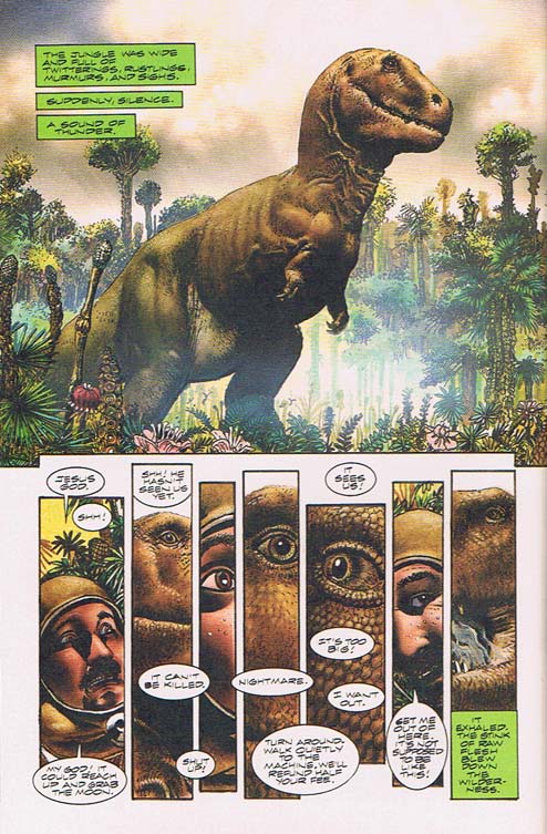
Fast forward 41 years to a different artist, Richard Corben. The producer of tons of work for "Heavy Metal", numerous album covers, and much, much more, Corben is a major figure in the history of fantasy illustration. The evolution of comics as a medium, both in terms of how it was perceived by the general public and in its visual storytelling toolkit, meant that Corben had a much different set of tools with which to work. Here's the same general section of the story as rendered by him:

The proportion of text to images is reversed here compared to Williamson's version. While both are still necessary to convey the full impact of the story, the visual elements carry the bulk of the load. Furthermore the page layout is much more dynamic, featuring one enormous panel to show the size and majesty of the dinosaur, and a series of very narrow panels to communicate the human drama and fear. Whereas Williamson uses mostly mid-range shots, Corben isn't afraid to zoom right in to the characters' eyes.
More subtly, by having the dialog appear in unattributed word balloons in the middle set of panels, the reader is put into the shoes of the main character. The whole world has narrowed down to a series of disconnected slices of sound and vision. All of our attention is consumed by the beast, eliminating all other sensory input. The tight constriction of the panels themselves heightens that feeling of claustrophobia, the suffocating feeling of fear in the face of an almost unimaginable threat.
Comics is not just illustrated words, or pictures with captions. It is a medium which, at its best, has a unique power to impact the reader, playing games with our experience of time and space like nothing else can. I think these two pages are a wonderful illustration of exactly how far the medium has come, how mature it is getting, and how powerful it can be. It also shows how important the artist's ability to lay out a page is; beyond just the draftsmanship required to make a dinosaur look like a dinosaur, the arrangement of the panels and the pacing of the story are hugely important to how successful an issue can be.
I don't mean to disparage Williamson in any way here, his adaption is hugely satisfying in its own way. But it is very much a product of its time. Seeing these two stories back to back make me not only appreciate how far the medium has come, but also wonder where it will take us in forty more years. I can hardly wait!
(Both pages shown above are ©1993 Byron Preiss Visual Publications, Inc. "A Sound of Thunder" published by Collier's, June 28, 1952, ©1952, 1990 Ray Bradbury. Illustrations ©1993, Richard Corben and Byron Preiss Visual Publications, Inc.)

